GameIconKitIcon and color sets for Flutter games
Material Icons ships with thousands of glyphs, and almost none of them are named
the way a game developer thinks. There is no sword, no
potion, no mana. What there is, scattered across
categories built for settings screens and email clients, is a smaller set that
reads perfectly well as fire, shield, gem, or curse — once somebody has gone
through and picked them out.
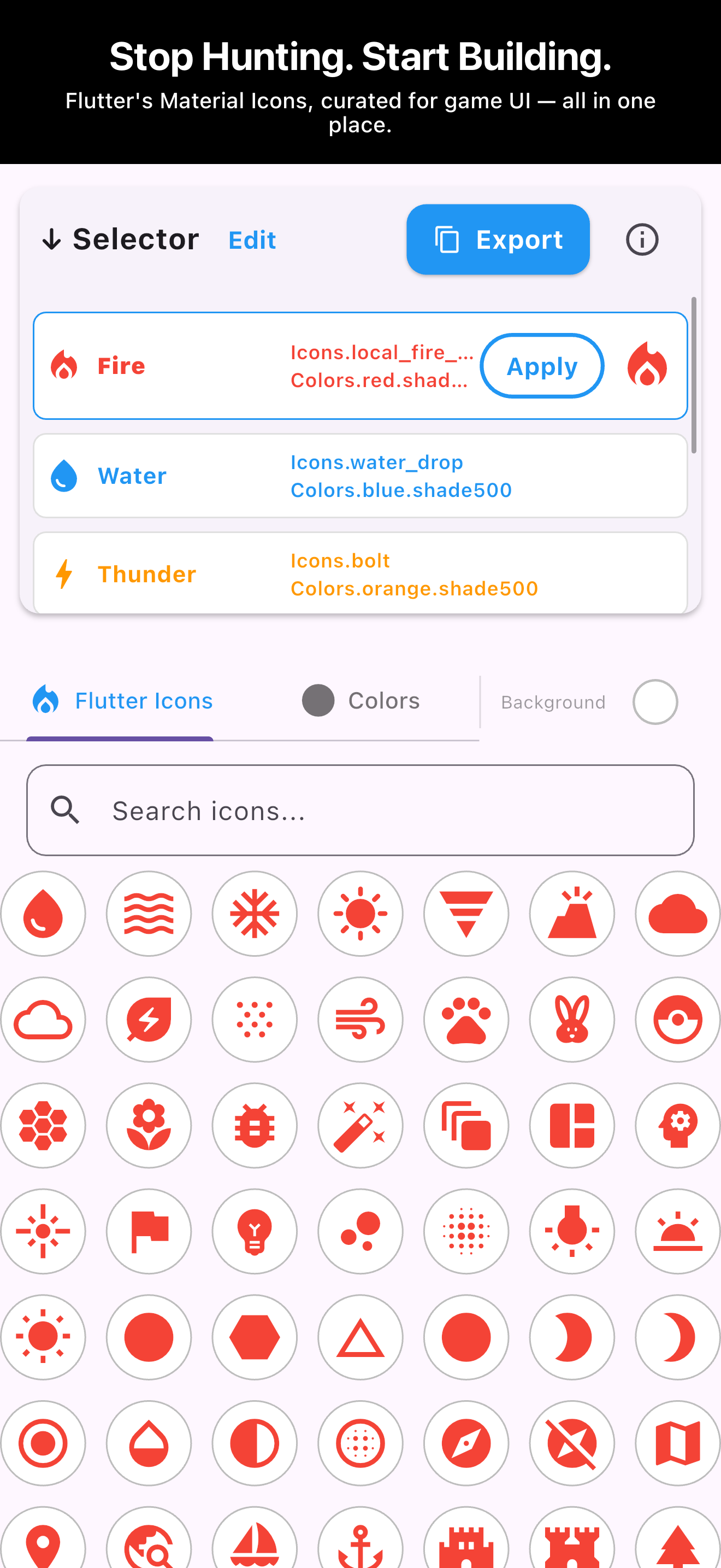
GameIconKit is that pass, already done. It holds 195 icons laid out in one grid,
ordered in themed runs — attack, then defense, gems, nature, and on through
twenty-four of them — and it does one thing beyond browsing: it lets you name
them. You build a table — Fire, Water, Thunder — give
each row an icon and a color, and export the whole thing with the Flutter names
already filled in.
It is worth being plain about what this is. GameIconKit is a picking and naming
tool for developers — not a game, and not an icon pack. Nothing is downloaded:
there are no PNGs, no SVGs, and no package to add to your pubspec. Every glyph it
shows already ships inside Flutter as part of the Material Icons font, and what
you take away is the list of names and colors you settled on, so the icons your
game draws come out of the font you already have.
Naming a set of elements or skills
This is the case the app was shaped around. A game has a handful of concepts that
recur everywhere — damage types, schools of magic, status effects — and each one
needs a glyph and a color that stay consistent from the skill tree to the combat
log. Deciding them one at a time, in whatever screen you happen to be building,
is how you end up with two different reds for fire.
The runs to scroll to first: attack at the top, then magic, nature and
elements, and the danger set further down.
- Press Edit. A set opens with five rows called
Untitled; the + button adds more, up to 30, and the
pencil on a row renames it. Name it after the concept rather than the picture —
Thunder, not bolt. The name is what you will reference in code,
so it should survive you changing your mind about the glyph.
- Press Done to leave edit mode, then select the row and pick
its icon. Search matches the Flutter name itself, so
fire finds
local_fire_department but nothing that is only conceptually fiery —
whatshot is in the set and search will not lead you to it. Treat the
box as a filter for names you already half-know, and the grid as the way to find
the rest.
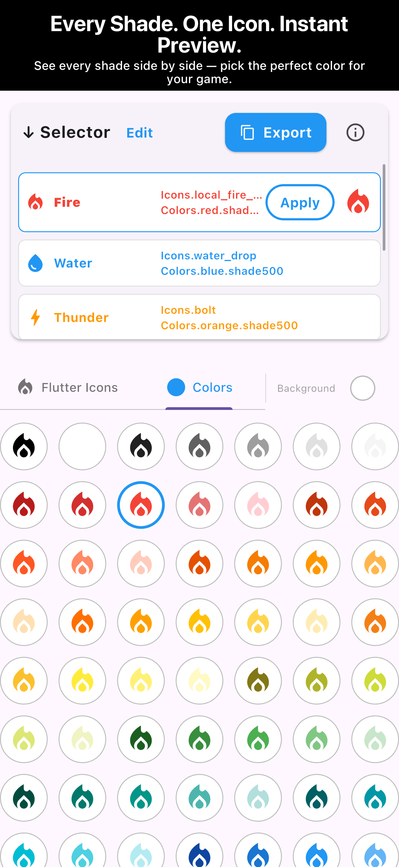
- Switch to Colors and choose the shade. The palette is drawn
using the icon you just picked, repeated 95 times — so you are comparing the
actual mark at its actual weight, not guessing from a square of color.
- Press Apply to confirm the row, then move to the next
concept. Rows stay in the Selector while you work through the set.
Deciding all of them in one sitting is what makes this worth doing. Sitting in
front of the same palette while you assign six elements keeps the set coherent — you notice
immediately that two of them landed on neighbouring blues.
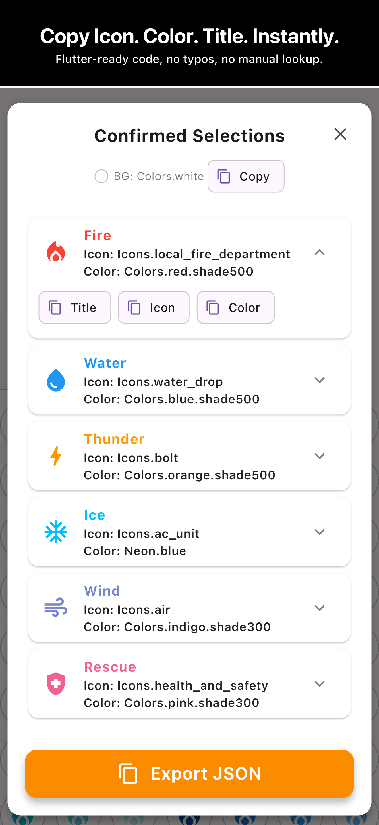
One thing to know about the Selector: each row prints the icon and color constant
under the name you gave it, and on a narrow window those get cut short with an
ellipsis — the row simply has less width than local_fire_department
needs. Nothing is lost; it is the display that is short, not the value. The
Confirmed Selections sheet is where you read them in full — it puts the icon and
the color on their own lines — and the copy buttons hand over the complete
constant regardless of what the row had room to show.
Building a rarity ladder out of one icon
Rarity is the case where color carries the meaning and the glyph should not
change. A common gem and a legendary gem are the same object; only the tier
differs. Repeating an icon across a color ramp says that far more clearly than
finding five different gem shapes.
The Colors tab is built for exactly this. Because the palette renders your chosen
icon rather than swatches, you can see the whole ladder at once and pick steps
that stay distinguishable — including at the size the icon will really appear.
Every cell is drawn on the current preview background as well, so the comparison
in front of you is already the one that matters; the Background
button beside the tabs is what changes that backdrop. It never touches the color
you assign to a row — it is only what the icons are shown against — though the
export does record which backdrop you judged them on, as a single
background entry at the top of the JSON.
The rule that carries most of the work is lightness, not hue: dark icons on a
light background, light icons on a dark one. Bright shades — amber, lime, cyan —
hold up on a near-black backdrop and turn to haze on white, and deep shades do the
reverse. What fails is any pair that matches in weight. Red on green is the
textbook case: both sit mid-dark, so the mark has almost nothing separating it
from the surface, and it is the same pair the commonest form of color blindness
flattens. Deep blue on deep purple fails identically with no color blindness
involved. Once two colors are close in lightness, no amount of hue difference
rescues the icon at HUD size.
- Make one row for each tier — Common, Rare,
Legendary — and set every row to the same icon, the gem or the star you
have chosen. The color is then the only thing separating the three rows, which is
what tells a player they are looking at one object at three grades rather than at
three different objects.
- Give each row a color that sits far from the others in the palette. The
palette runs dark to light inside each hue family, so two shades that sit next
to each other in the grid read as one tier at a glance; put several cells
between your picks, or move to a different hue family entirely. Grey for
Common, a mid blue for Rare, gold for Legendary is the version players already
know how to read.
- Change the preview background from light to dark and look at the three rows
again. Any tier that disappears against one of the two backgrounds cannot be
used, because you do not control which background it will be seen on.
Filling in the HUD
Health, currency, ammunition, a warning that a timer is running out — the marks
that sit in the corner of the screen and have to be read in a glance. How large
you draw them is your call, but Material Icons are drawn on a 24-pixel grid and
a HUD is where you are most likely to go below it. These are chosen under a
different constraint from skill icons: detail is a liability. An icon with three
internal shapes turns to mush once it is small enough, while a plain heart or a
coin survives anything.
The runs that cover most of it are UI symbols, economy, growth and status, and
danger. This is the part of the app where scrolling beats searching outright: the
heart is filed as favorite and the coin as monetization_on,
so the words you would actually type return nothing while both marks sit in plain
sight in the grid. When two candidates look equally good there, the simpler outline
is the one that will still work.
The export sheet helps here in a small way that matters during layout work: each
row can be expanded to copy its title, icon, or
color separately. When you are wiring up a widget and only need
Icons.favorite on its own, you do not have to take the whole entry
and delete the rest.
None of this is limited to games. The same table — a fixed set of named concepts,
each holding one glyph and one color that never drift apart — is what a habit
tracker needs for its streak tiers, what a learning app needs for its badges, and
what a checklist needs to tell its states apart at a glance. Reaching for a flame
or a shield instead of the usual circled exclamation mark is also the cheapest way
to give an ordinary screen some character. The grid is grouped around game
concepts because that is where the vocabulary is richest, not because the icons
stop working anywhere else.
Getting it into your project
Export JSON copies the finished table to the clipboard: one
object, keyed by the names you chose, each holding the icon and the color as the
constant you would type yourself — Icons.local_fire_department,
Colors.red.shade500. There is no file to download and no library to
add; those names resolve against the Material Icons font that ships with Flutter
already. It is JSON rather than Dart, so it is something to read your constants
off rather than a file you drop in — which in practice means copying the values
into wherever you keep them, or letting the per-row copy buttons hand them over
one at a time.
Twelve of the shades are the exception worth knowing about. The neon and metallic
entries at the end of the palette are custom colors, not Material ones, and they
export under names of their own — Neon.cyan,
Metallic.gold. Those are labels, not identifiers that exist in
Flutter, so a gold rarity tier needs a Color(0xFFFFD700) written by
hand at the other end. The Material shades, which is the rest of the palette,
need nothing.
Your rows are kept on the device between sessions, so a set left half-finished is
still there tomorrow.
On the browser version there is one caveat worth knowing: your rows live in the
browser's own storage, and browser storage is not permanent storage. Clearing site
data removes it, a private window never keeps it in the first place, and browsers
evict it on their own when a page has not been opened in a long while. The iOS app
keeps its rows in the app's own storage, where only uninstalling clears them.
Either way, Export JSON is the backup: once that text is sitting
in your project — or anywhere you can find it again — the set no longer depends on
anything remembering it for you.
What else it does
| Icon library |
195 icons in one grid, ordered in 24 themed runs — attack, defense, gems
and rarity, nature, creatures, magic, adventure, sci-fi, UI symbols, economy,
status and more. The search box filters on the Flutter name. |
| Colors |
95 shades, previewed on the icon you are working with rather than as
swatches. 83 are Material shades; the 12 neon and metallic ones are custom
colors. |
| Background preview |
Swap the backdrop to check contrast. It never changes the color assigned
to a row, and is recorded in the export only as a single
background entry. |
| Export |
The whole table as JSON to the clipboard, or title, icon and color copied
individually per row. |
| Set size |
Up to 30 rows per set. Rows are added and removed in Edit mode, and
renamed from the row itself. |
| Storage |
Rows are saved on your device. No account, no server, nothing uploaded. |
| Price |
Free to use and free to export, with no paid tier and nothing to
unlock. |
The walkthrough, the FAQ, and what the library covers are on the
support page.
Note: Icons and JSON produced with GameIconKit incorporate
third-party material such as Material Icons, governed by their own licenses.
You are responsible for complying with those licenses and for confirming that
any asset suits your intended use, including commercial use. See
Licenses.
Open the picker with the GameIconKit button in the header. It is on the App
Store as well, for when you are away from the desk.